Good mood, good appetite:
how colours and materials can influence mood and eating behaviour.
‘Experience teaches us that individual colours create particular moods.’ - Goethe already knew that colours can trigger and intensify moods and emotions. Knowledge of the effect of individual colours is used in advertising, for example, but also therapeutically in light and colour therapy. And most people have probably heard that cold colours such as blue have a calming effect and warm colours such as red, yellow and orange have a stimulating effect.
Today, no one would question the fact that colours, shapes, light and materials have a direct influence on our sense of well-being. In professional interior design, special emphasis is therefore placed on these points. Colours and shapes also play an important role in the design of canteens and cafeterias.
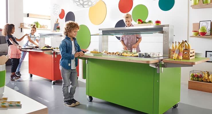
The little ones enjoy the colourful variety
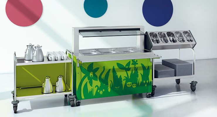
When , the focus should be on a cheerful, trustworthy design: bright colors, harmonious shapes and individual design put you in a good mood and can create a relaxed atmosphere.

Colours that are reminiscent of fresh fruit and vegetables automatically send signals to the brain that stimulate the appetite: Yellow, red, green and orange offer many fresh and light-hearted nuances that can make even the most die-hard vegetable haters and fruit refusers want a piece of fresh nature on their plate.
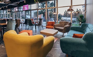
The older ones go for stylish and urban
The style and atmosphere are well received by older pupils, teenagers and students. Here, things can be a little more grown-up: subtle or stylish colours - such as broom yellow or petrol green - and casual wooden designs are particularly popular. Timeless classics such as grey, white and black are also always up-to-date with these target groups.
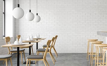
Individuality for identification and acceptance
The skilful use of colours and shapes creates a good atmosphere in the canteen - and can therefore significantly increase the frequency of visits. The icing on the cake when it comes to design is genuine individuality: for example, the use of the school logo, self-created image motifs or a completely unique colour that the pupils were allowed to vote on together. This high degree of individuality is also reflected in the extremely high level of acceptance of the canteen by the pupils. It becomes their meeting place, their place-to-be, of which the pupils are proud and which they simply enjoy visiting.
Colours and their effect
In colour psychology, colours are said to have direct effects on the soul and body. However, colours are rarely used in such absolute terms in everyday life. It is their skilful combination and the many mixed and intermediate shades that ultimately determine the effect. The following is a summary of the most important basic colours and the properties attributed to them:
Red
stands for vitality and energy. Red can activate and warm you up. It stimulates circulation, metabolism and the immune system. In rooms, red should only be used as an impulse, as too much red can make you restless.
Orange
is the symbolic colour for optimism and joie de vivre. Orange is a mood enhancer and symbolises open-mindedness, sociability and self-confidence. Rooms with orange promote sociability and radiate cosiness.
Yellow
is the colour of the sun. Yellow stands for light, optimism and joy. Yellow makes rooms appear larger and friendlier. Yellow promotes concentration and creativity and has a stimulating effect on conversations.
Green
is the colour of nature. It calms, harmonises and stands for security. Green is perceived as generous and confidence-inspiring. In rooms, green provides calm, security and creativity.
Cyan/Turquoise
is a cool but fresh colour. Turquoise conveys spiritual openness and freedom. Turquoise gives rooms a very personal and special touch. It refreshes the senses and conveys clarity.
Blue
stands for calm, trust and longing. It is said to promote language skills and clear thinking. Blue is often used in rooms that are intended relaxation.
Purple/violet
stands for dignity and protection. The shades are considered the colours of inspiration and art and are said to strengthen concentration and self-confidence. As purple is considered to curb the appetite, it should only be used to a limited extent in dining rooms.
Magenta/pink/pink are soft colours that bring joy as flowers in nature. They embody idealism, order and compassion. According to experts, pink is a colour that soothes and reduces aggression.
White is a symbol of purity, clarity and innocence. White is a magical colour that can be used for any other colour, as its light spectrum contains almost all colours. In rooms, white is the ideal combination colour. It neutralises, brightens and invigorates.
Brown
is the calm wood and earth colour. It conveys a sense of security. Brown has a calming and balancing effect in rooms. Earthy colours such as ochre or sienna and all types of wood can be used in almost any room.
Grey
is the colour of neutrality and restraint. It is unobtrusive and sober. Grey offers other colours and shapes a discreet stage for their effect. In rooms, grey should be used as a combination colour.
Black
looks elegant and solemn in fashion. Black is cool. It conveys seriousness and generates respect. In interior design, black should be used as an accentuating counterpoint or for deliberate coolness and simplicity.

Fancy fresh colours and first-class technology in the canteen?
The professionals at B.PRO will be happy to advise you without obligation:

B.PRO Solutions UK Ltd. 1 Victor Way, Colney St
UK - AL2 2FL St. Albans
- Phone: +44 1923635251
- Write e-mail
 The B.PROTHERM K: Now with a removable convection heater
We've made the tried-and-tested classic even better. The B.PROTHERM K front loader with convection heating is now dishwasher safe, including the lid. This offers a lot of added value in everyday use.
 "In Austria, personal relationships are what count"
The team at B.PRO Austria supports customers with a clear understanding of the special features of commercial catering in our neighbouring country. Sales Director Kurt Wankat describes how personal proximity and increasing automation are shaping the Austrian market.
 Hotel breakfasts as a revenue driver
Breakfast is an important criterion for hotel guests. Whether a city break, business trip or family vacation: any hotel that scores well in the morning will enjoy a real competitive advantage. B.PRO combines efficient process reliability with high-quality user experiences here.
